Ut Shrounda: A Display Font That Anchors Boldness With Clarity
I was halfway through designing the hero section for a new coaching website—clean layout, warm neutral palette, intentional whitespace—when the headline felt flat. Not unattractive, just… undifferentiated. I’d been using a solid but predictable sans serif for headings, and while it worked, it didn’t *say* anything about the brand’s grounded yet energized voice. That’s when I dropped Ut Shrounda into the mockup.
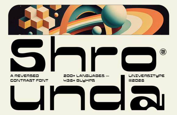
Right away, something shifted. Ut Shrounda isn’t flashy in the way some display fonts are—no exaggerated serifs, no jittery strokes, no forced whimsy. Instead, it leans hard into horizontal weight: thick, confident bars across the top and bottom of letters like “E,” “F,” and “H.” The contrast is reversed—not thin stems with thick crossbars, but thick horizontals with refined verticals. It feels architectural, almost tactile, like letterforms carved from calm, focused intention.
In practice, that means Ut Shrounda brings presence without shouting. On the coaching site, I used it for the main headline (“Clarity Starts Here”) over a soft gradient background. At desktop size, its structure created instant hierarchy—readers’ eyes landed first, stayed longer, and absorbed the message before scrolling. On mobile? I tested it at 32px with generous letter-spacing (1.5px), and it held up cleanly—even on mid-tier OLED screens. No blurring, no hinting hiccups. Just crisp, confident shape.
Ut Shrounda shines where digital typography needs to do two things at once: command attention *and* feel trustworthy. That makes it ideal for hero titles, campaign banners, course sales pages, portfolio project names, and boutique online store headers. I also tried it on a subtle CTA button (“Begin Your Session”)—not as body copy, never as paragraph text—but as a compact, high-impact anchor. Paired with a neutral, highly legible sans serif like Inter or Manrope for supporting text, Ut Shrounda became the visual equivalent of a firm handshake: warm, steady, and memorable.
It’s not a font for long-form reading. And that’s by design. As a display font, Ut Shrounda excels in short bursts: section headings, logo lockups (especially when used as wordmark-only), social media cover graphics, email subject lines, and branded digital ads. Its rhythm invites scanning—not deep reading—and that aligns beautifully with how users actually move through modern web interfaces. On a blog redesign I’m prototyping, I’m using Ut Shrounda only for post titles and category labels—never for bylines or excerpts. That contrast keeps the content scannable while giving each piece distinct visual weight.
Readability checks matter, especially in real contexts. I tested Ut Shrounda over image overlays (with subtle darkening), on light and dark mode backgrounds, and inside tight responsive containers like mobile navigation bars. On light backgrounds, it’s strong and open. Over muted photography, a slight text shadow or background tint helped maintain contrast without sacrificing elegance. On dark mode, it retained clarity—no need for bold overrides or tracking adjustments. What stood out most was its consistency across devices: no unexpected glyph substitutions, no missing diacritics in test phrases with accented characters. That tells me the typeface includes thoughtful multilingual support—a quiet but critical win for any global-facing digital brand.
Pairing Ut Shrounda thoughtfully is key. I’ve found it sings alongside humanist sans serifs (like Poppins or Lato) for balance—letting Ut Shrounda carry expressive weight while the companion font handles information flow. For a more editorial or premium feel—say, on a digital brand kit or newsletter header—I’ve paired it with a restrained serif like Crimson Pro or Literata. The contrast between Ut Shrounda’s structural confidence and a serif’s quiet rhythm creates sophisticated tension, not visual noise.
Before deploying Ut Shrounda in production, I double-checked three practical things: First, its webfont availability—yes, it’s offered in WOFF2 format with fallback options, which matters for fast-loading pages. Second, its included styles—regular and bold weights, plus true italics (not slanted), so I could use emphasis without breaking typographic integrity. Third, licensing—this is a commercial font, fully cleared for client websites, SaaS dashboards, e-commerce banners, and downloadable digital assets like PDF workbooks or Notion templates. No surprises at handoff time.
What surprised me most wasn’t how well Ut Shrounda looked—it was how much it *streamlined decisions*. Once I committed to it for primary headers, everything else fell into place faster: spacing ratios, color contrast choices, even icon style direction. It acted less like decoration and more like a design constraint that clarified intent. That’s rare for a display font.
If you’re choosing a typeface to represent your digital brand—not just decorate it—Ut Shrounda offers something quietly powerful: structure with soul, distinction without distraction, and a kind of visual reliability that builds trust before the first sentence is read. It doesn’t try to be everything. It’s designed to be *exactly* what a headline, a title, or a moment of emphasis needs to be: anchored, articulate, and unmistakably yours.
- Best for: Hero headlines, section titles, CTA buttons, logo wordmarks, campaign banners
- Avoid for: Body copy, small UI labels (<14px), dense data tables
- Pair with: A legible sans serif (e.g., Inter, Manrope) or a refined serif (e.g., Crimson Pro, Literata)
- Check before launch: Webfont formats (WOFF2 recommended), weight range, multilingual glyphs, commercial license scope